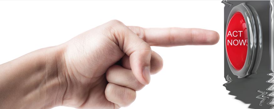
What is a “Call to action?”
“Call to Action – CTA” is a necessity for any website, commercial or an advertisement. It could be a button, banner, type of graphic, or text which produces an urge in the mind of the viewer or reader prompting him to click on it.
CTA’s are business words of promotion message to take an impulse action such as “Call now”, “Click here”, “Fill this form”, etc. Any trade commercial or an advertisement is considered as incomplete without a Call to action.
Now a days, we see most of the websites are designed in such a way having a Call to action implemented. It is the biggest sales strategy put into action in an easy way to start the conversational aspect with the person at other side. CTA’s are designed and glued in such a way that a reader’s focus automatically goes to it and he is provoked to make the desirable action that the retailer wants him to make.
Why are CTA’s important?
Whenever a person enters any website, he reads about the things written in website matching up with his requirement. After determining all the necessary things he would instantly want to contact the retailer. At such moment, CTA’s come into demand, when a person naturally sees a CTA prompting him to contact the vendor. With a ‘Call to Action’ insertion in your website, you can keep a track of clicks and leads. It also reveals how efficient your content is & how much your website or commercial content is impacting the mind of viewers. Thus, CTA’s provide a user friendly layout to the user with fast proceedings & is obviously a big bonus for the retailer.
Components of an effective CTA –
Striking design
To make someone click on your CTA, firstly the design should be noticeable. The colour contrast should be well versed with the colours of the website, the size of a CTA should be large enough to make it showy (normally the best perform size is around 225px wide and 45px high).
Text written on the CTA
A short and to the point text should be written on the CTA copy, which should be a jargon free phrase. The language should be such as asking the user to make some action on it. Therefore, actionable but clear verbs should be used on the ‘Call to action’ copy.
Display a clear vison
Always exhibit a clear vision to the viewer that what exactly will happen after clicking on the CTA. People shall know explicitly what the CTA wants to tell them. There shall be no confusions on the text written on CTA copy and the action being performed after clicking on it whether that be a “Download a copy” of any eBook or be “contact us” form, etc.
Alignment of Landing page
There should mostly be a landing page for a CTA to make it more effective. It looks more persuasive if viewers are taken to a dedicated page after clicking on the CTA. Like, after clicking on to the CTA it directs the person to the contact us page and so on.
These are some of the basics to be considered while designing & creating a Call to action. Green bird media, one of the best website design & development firm in San Diego for Drupal and other platforms has a much focussed vision on understanding a customer’s business and sales strategy to provide them with a strike through by creating creative CTA implemented websites to pertain their goals, and a sturdy SEO and Digital Marketing approach to convert the goals to conversions. Green Bird media has worked for a large number of organisations, non-profit organisations, small and enterprise businesses. For more details, you may contact us at (619) 393-6680 or info@greenbirdmedia.com

